Section4.4Summary Statistics: Measures of Variation
Objectives
Students will be able to:
Calculate and describe the measures of variation: standard deviation, range and interquartile range (IQR)
Calculate the 5-number summary and construct boxplots by hand and/or using technology
Compare distributions with side-by-side boxplots and percentiles
Consider these four sets of quiz scores for a 10-point quiz:
Section A:
5
5
5
5
5
5
5
5
5
5
Section B:
0
0
0
0
0
10
10
10
10
10
Section C:
4
4
4
5
5
5
5
6
6
6
Section D:
0
5
5
5
5
5
5
5
5
10
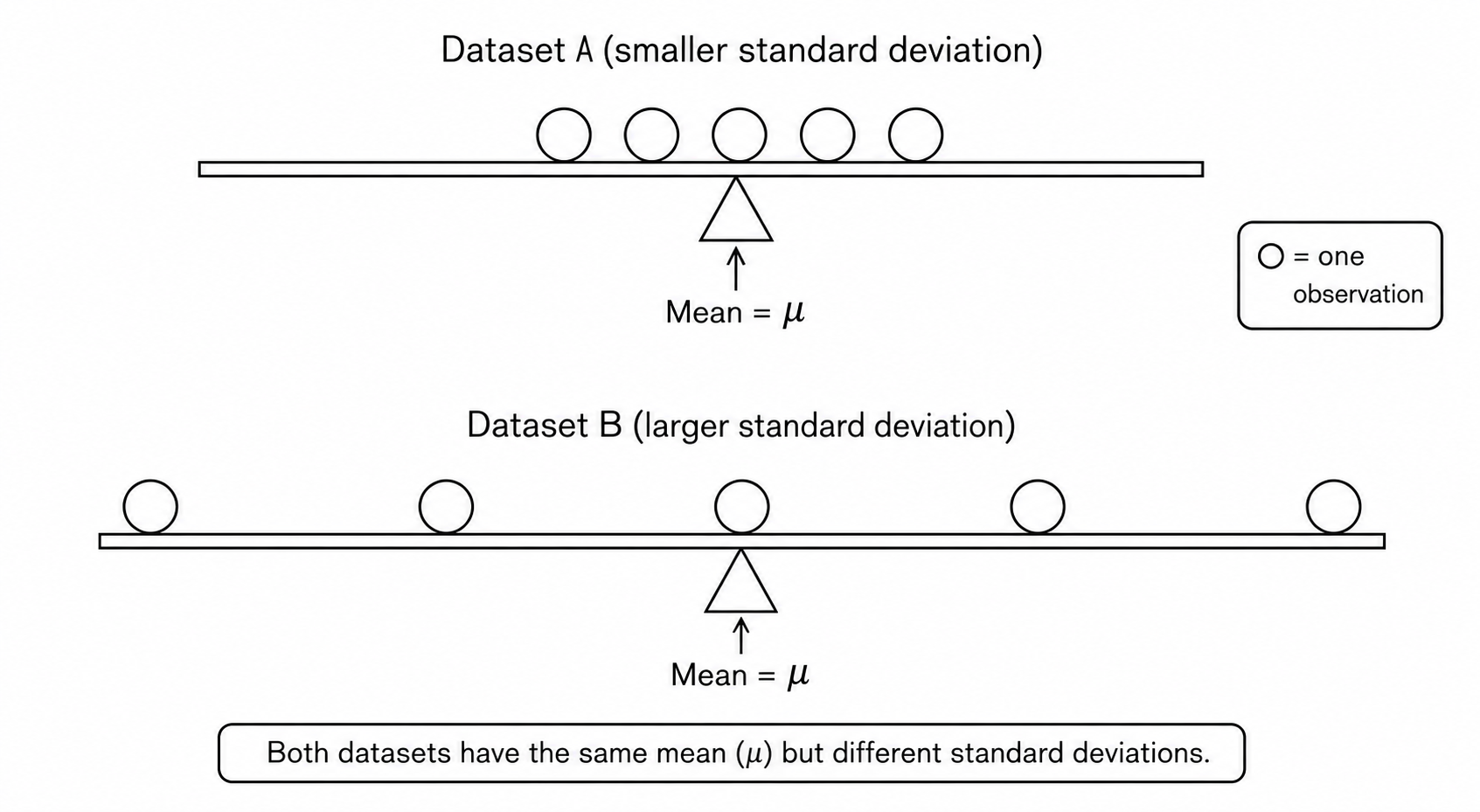
All four data sets have a mean of 5 points and median of 5 points, yet the sets of scores are clearly quite different. In Section A, everyone had the same score; in Section B half the class got no points and the other half got a perfect score. Section C was not as consistent as section A, but not as widely varied as section B. Section D is similar to section B in that it has a wide range of scores, but there are more scores in the middle and fewer at the extremes.
Thus, in addition to the mean and median, which are measures of center or the “average” value, we also need a measure of how “spread out”" or varied each data set is.
There are several ways to measure the variation of a distribution. In this section we will look at the standard deviation, range and the interquartile range (IQR).
Subsection4.4.1Standard Deviation
The standard deviation, is a measure of variation that approximates how far, on average, the data values deviate, or are different from, the mean. The mean and standard deviation are paired to provide a measure of center and spread for symmetric distributions. We use the letter \(s\) for the standard deviation of a sample and the lowercase Greek letter \(\sigma\) (sigma) for the standard deviation of a population.
Standard Deviation.
The sample standard deviation is
\begin{equation*}
s=\sqrt{\frac{\text{Sum of the squared deviations from the mean}}{n-1}}
\end{equation*}
and the population standard deviation is
\begin{equation*}
\sigma=\sqrt{\frac{\text{Sum of the squared deviations from the mean}}{n}}
\end{equation*}
where \(n\) is the sample size, or the number of data values.
We can write these formulas using more formal mathematical notation as:
We will go through the whole process for calculating the standard deviation of Section D from above.
The mean quiz score, like in Sections A, B and C, is 5 points.
The first step in finding the standard deviation is to find the deviation, or difference, of each data value from the mean. We will do this in a table. You could also use a spreadsheet to do these calculations.
Data Value
Deviation: (Data Value – Mean)
0
\(0-5=-5\)
5
\(5-5=0\)
5
\(5-5=0\)
5
\(5-5=0\)
5
\(5-5=0\)
5
\(5-5=0\)
5
\(5-5=0\)
5
\(5-5=0\)
5
\(5-5=0\)
10
\(10-5=5\)
We would like to get an idea of the “average” deviation from the mean, but if we find the average of the values in the second column, the negative and positive values cancel each other out (this will always happen), so to prevent this we square the deviations which results in a postive number.
Ordinarily, we would then divide by the number of scores, \(n\text{,}\) (in this case, 10) to find the mean of the deviations, but the division by \(n\) is only done if the data set represents a population. When the data set represents a sample (as it almost always does), we divide by \(n–1\) (in this case, 9). The reason for this is that we should assume the population is more diverse than the sample we are looking at, and dividing by a smaller number gives us a larger value for the standard deviation to better represent the variability. (The reason we use \(n-1\) exactly has to do with degrees of freedom which is beyond the scope of this text.)
We assume Section D represents a sample, so we will divide by \(10-1=9\text{.}\) (If this had been a population, we would have divided by 10.) Note that our units are now points-squared since we squared all of the deviations. It is much more meaningful to use the units we started with, so to convert back to points we take the square root.
For comparison, here is the standard deviation for each section listed above:
\(S_{A}=0\) points
\(S_{B}=5.27\) points
\(S_{C}=0.82\) points
\(S_{D}=2.36\) points
For the standard deviation, we usually use two more decimal places than the original data. This tells us that on average, scores were approximately 2.36 points away from the mean of 5 points.
One technical side note: the sample standard deviation is the square root of an inflated average of the squared deviations from the mean, which isn’t exactly the same as the average distance from the mean, but it is a good approximation and has some nice mathematical properties that make it the most commonly used measure of variation.
In summary, here are the steps to calculate the standard deviation by hand.
Calculating the Standard Deviation.
Find the deviations by subtracting the mean from each data value
Square each deviation remembering that these values will all be positive
Add the squared deviations
Compute the square root of the sum divided by \(n-1\text{:}\)
\begin{equation*}
s=\sqrt{\frac{\text{Sum of the squared deviations from the mean}}{n-1}}
\end{equation*}
There are a few important characteristics we want to keep in mind when finding and interpreting the standard deviation.
The standard deviation is never negative. It will be zero if all the data values are equal, more spread out data will result in a larger standard deviation.
The standard deviation has the same units as the original data and it is important to label it.
The standard deviation, like the mean, can be highly influenced by outliers.
Example4.4.1.
To continue our peanut butter example, we will find the standard deviation of this sample in dollars: 3.29, 3.59, 3.79, 3.75, and 3.99.
The first thing we need to find is the sample mean, and we know it is $3.68 from our previous work. Next, we need to find the deviation from the mean for each data value and square it.
Since the units are dollars, we will round to two decimal places rather than two more than the data. This gives us a standard deviation of $0.26. Together with the mean this tells us that on average, the cost of a jar of peanut butter is $0.26 away from the mean of $3.68.
Calculating the standard deviation by hand can be quite a nuisance when we are dealing with a large data set, so we can also use technology. We use the spreadsheet function =STDEV.S to find the sample standard deviation. Notice that this is different from the population standard deviation, which uses the function =STDEV.P.
Just like the spreadsheet functions =AVERAGE and =MEDIAN, we can either list the individual data values in the formula, or we can enter the data values into a row or column and use the row or column range in the formula.
Example4.4.2.
The total cost of textbooks, in dollars, for the term was collected from 36 students. Use a spreadsheet to find the mean, median, and standard deviation of the sample.
140
160
160
165
180
220
235
240
250
260
280
285
285
285
290
300
300
305
310
310
315
315
320
320
330
340
345
350
355
360
360
380
395
420
460
460
Since we are finding more than one statistic for this data set, it is much more efficient to enter the data values into a row or column and reference the range in each of the formulas. We enter the data into column A.
Solution.
For the mean we enter:
=AVERAGE(A1:A36)
and get a result of $299.58.
For the median we enter:
=MEDIAN(A1:A36)
and get a result of $307.50.
For the standard deviation we enter:
=STDEV.S(A1:A36)
and get $78.68.
The mean and the median are relatively close to each other, so we can expect the distribution to be approximately symmetric with maybe a slight skew to the left, since the mean is smaller. The mean and standard deviation together tell us that the average cost of textbooks for a term is about $299.58, give or take $78.68.
The standard deviation is the measure of variation that we pair with the mean for approximately symmetric distributions. This pairing should make sense because the standard deviation uses the mean in its calculation. But what about the median? What measure of variation do we pair with it?
Subsection4.4.2Range
One candidate is the range. The range tells us the spread or width of the entire data set. We calculate the range as the difference between the maximum and minimum value.
However, the range is not a very good measure of variation since it is very strongly affected by skew and outliers. Consider, for example, the distribution of full time salaries in the United States. Many people earn a minimum wage salary, while others like Jeff Bezos (Amazon) and Bill Gates (Microsoft) earn millions (if not billions!). A range this large does very little to help us get a sense of the spread where most of the data values lie.
Subsection4.4.3Quartiles and the Interquartile Range
Instead, the measure of variation that we pair with the median is the interquartile range (IQR). The IQR tells us the width of the middle 50% of data values. By cutting off the lower and upper 25% of data values, we are able to ignore extreme values and provide a more accurate sense of how spread out the distribution is.
The IQR is calculated as the difference between the third quartile (Q3) and the first quartile (Q1). Before we can calculate the interquartile range, though, we need to learn how to find the first and third quartiles.
As the name implies, quartiles are values that divide the data into quarters. The first quartile (Q1) is the value that 25% of the data lie below. The third quartile (Q3) is the value that 75% of the data lie below. As you might have guessed, the second quartile is the same as the median since 50% of the data values lie below it. Then the interquartile range is the difference between the third and first quartiles; it tells us how large the spread is of the middle 50% of data values.
Quartiles.
\(Q_{1}\) is the first quartile: 25% of the data lie below this value
\(Q_{2}\) is the second quartile, which is the same as the median: 50% of the data lie below this value
\(Q_{3}\) is the third quartile: 75% of the data lie below this value
\(\text{IQR} = Q_{3} - Q_{1}\) is the interquartile range
There are several acceptable methods for finding quartiles, and you may see different methods used in different textbooks, spreadsheet programs, and statistical software. The resulting values may be slightly different depending on the method used. In this book, we will use the locator method.
Suppose, for example, we have measured the height, in inches, of 12 people who identify as female. The data values, in numerical order, are listed below.
59
60
61
63
64
64
66
66
67
69
70
72
Since the number of data values is divisible by four, the data divide evenly into four groups:
The first quartile occurs between the first and second groups of values. This is between 61 and 63, so we take the average of these two values to get Q1=62 inches.
The second quartile is the median which occurs between the second and third groups of values. This falls between 64 and 66, and averaging those values we get the median to be Q2=65.
The third quartile occurs at the dividing line between the third and fourth groups of values which is between 67 and 69, so we take the average of these two values to get Q3=68 inches. Therefore, the interquartile range is Q3-Q1=68-62=6 inches. This means that the middle 50% of people in this data set are all within 6 inches of each other in height.
What if the dataset cannot be divided evenly into four groups? For example, if we had 13 data values instead of 12, there would be \(13\div 4 = 3.25\) numbers in each group, which is a problem. There are several valid approaches to solve this problem, and we will use an approach called the locator method. Our locator is \(L=0.25\cdot 13=3.25\text{.}\) Any time the locator is not a whole number, we go up to the next whole number, which is 4 in this case. Then the first quartile is the data value in the fourth position as seen in the next example.
Example4.4.3.
Suppose we added one more height (68 inches) to the data set from the previous example. We will again find Q1, Q3, and the IQR of the heights.
59
60
61
63
64
64
66
66
67
68
69
70
72
Solution.
For Q1, we first calculate 25% of 13 which is \(0.25\cdot 13=3.25\text{.}\) Since 3.25 is not a whole number, we will go up to the next whole number which is 4. Now looking back at the data, we find the 4th value, which is Q1=63.
Similarly, for Q3, we calculate 75% of 13 to get 9.75. The next larger whole number is 10, so we find the 10th value, which is Q3=68 inches.
Therefore, the interquartile range is Q3-Q1=68-63=5 inches. This means that the middle 50% of people in this data set are all within 5 inches of each other in height.
We can summarize the locator method for finding quartiles as follows.
Locator Method for Finding Quartiles.
Write the data in order from smallest to largest.
Find the locator \(L\text{.}\) For the first quartile, \(L=0.25n\text{.}\) For the third quartile, \(L=0.75n\text{.}\)
If \(L\) is a whole number, then the quartile is the average of the data values in the \(L\)th and \((L+1)\)th positions.
If \(L\) is not a whole number, then the quartile is the value in the position of the whole number greater than \(L\text{.}\)
While we aren’t actually rounding, many students find it helpful to think that we "round up" any decimal values.
The locator method can also be used to find the median, which is Q2, using \(L=0.50n\text{.}\) In the 13-number dataset above, the locator of the median (Q2) is \(L=0.5\cdot13=6.5\text{.}\) Since 6.5 is not a whole number, we round up to 7 and find that the 7th value, the median, is 66 inches. This approach can be broadened to find the value of particular percentiles, too!
Example4.4.4.
Find Q1, Q3, and the IQR for the dataset below that represents the scores on a recent exam in a mathematics class.
0
9.4
18.1
65.6
70.6
80
81.9
82.5
84.4
88.5
91.9
92.5
95
99.4
100
100
Solution.
There are \(n=16\) values. For the first quartile, the locator is \(L=0.25\cdot16=4\text{.}\) Since 4 is a whole number, we will find the average of the fourth and fifth values:
Therefore, the first quartile is Q1=68.1 which means that 25% of the students scoreded below 68.1 on the test.
For the third quartile, the locator is \(L=0.75\cdot16=12\text{.}\) Since 12 is a whole number, we will find the average of the twelfth and thirteenth values:
Therefore, the third quartile is Q3=93.75, which means that 75% of the students scored below 93.75 on the test. It also means that 25% of the students scored above 93.75 on the test!
There is a spread of 25.65 percentage points among the middle 50% of test scores.
Subsection4.4.4The Five-Number Summary and Boxplots
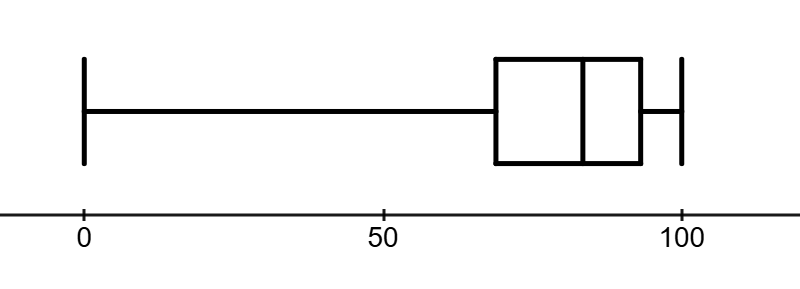
The five-number summary consists of the minimum, first quartile, median, third quartile, and maximum, separated by commas. These five numbers give us a good summary of the center and spread of the data. For example, the five-number summary of the dataset of test scores in the previous example is: 0, 68.1, 82.5, 93.75, 100.
A boxplot, also called a box and whisker plot, is a visual representation of the five-number summary.
Figure4.4.5.Boxplot of test scores.
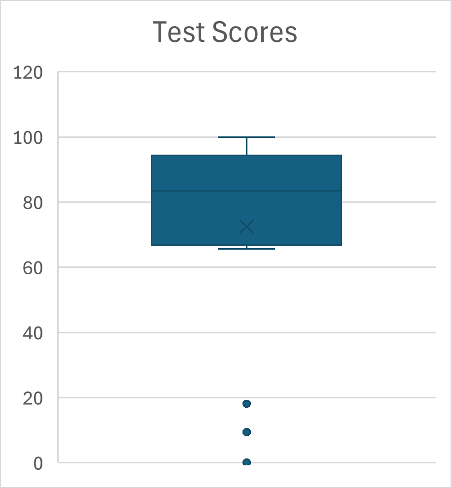
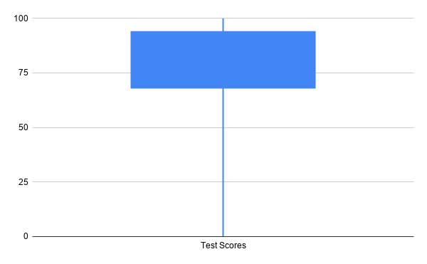
Boxplots are often displayed vertically, and outliers, which are values significantly greater or lower than the other values, may be displayed as points and excluded from the five-number summary. The boxplots below were created using Microsoft Excel on the left and Google Sheets on the right. They represent the same test score data.
In addition to the use of dots to indicate outliers, Microsoft Excel boxplots include an X to indicate the mean. Boxplots created with Google Sheets provide less information: the do not indicate outliers or the locations of the mean or even the median.
The primary application of boxplots is in comparing multiple datasets. When multiple boxplots are displayed side-by-side of stacked above each other using the same scale, we can compare the datasets quickly.
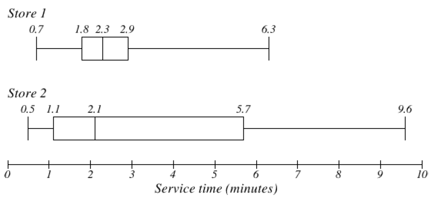
Example4.4.6.
The box plots of service times for two fast-food restaurants are shown below. Compare the length of time to get served at the two restaurants.
Solution.
Store 2 has a slightly shorter median service time (2.1 minutes vs. 2.3 minutes), but the service times are less consistent, with a wider spread of the data.
The 75th percentiles are 2.9 and 5.7 minutes. That means at store 1, 75% of customers were served within 2.9 minutes, while at store 2, 75% of customers were served within 5.7 minutes.
Which store should you go to in a hurry? That depends upon your opinion about luck – 25% of customers at store 2 had to wait between 5.7 and 9.6 minutes.
Exercises4.4.5Exercises
Many of the datasets from the Measures of Center section are repeated here so you can use your previous work to help you.
1.
A group of diners were asked how much they would pay for a breakfast in dollars. Their responses were:
7.50
25
10
10
7.50
8.25
9
5
15
8
7.25
7.50
8
7
12
Using your mean from Exercise 4.3.6.1, find the standard deviation of this data. Explain what the mean and standard deviation tell you about how much the group of diners would pay for a meal.
Calculate the five-number summary for this data.
Calculate the range and IQR for this data.
Create a boxplot for the data.
2.
The amount of commercials in an hour of television varies by channel. The total length (in minutes) of all commercials from 8 pm to 9 pm for some randomly selected broadcast and cable channels on a weekday evening were:
10
12.75
7
9
9.75
6.5
12.5
12.5
8.75
17
10.5
2
Using your mean from Exercise 4.3.6.2, find the standard deviation of this data. Explain what the mean and standard deviation tell you about how much the group of diners would pay for a meal.
Calculate the five-number summary for this data.
Calculate the range and IQR for this data.
Create a boxplot for the data.
3.
You recorded the time in seconds it took for 8 participants to solve a puzzle. The times were:
15.2
18.8
19.3
19.7
20.2
21.8
22.1
29.4
Using your mean from Exercise 4.3.6.3, find the standard deviation of this data. Explain what the mean and standard deviation tell you about how much the group of diners would pay for a meal.
Calculate the five-number summary for this data.
Calculate the range and IQR for this data.
Create a boxplot for the data.
4.
You weigh 9 Oreo cookies, and you find the weights (in grams) are:
3.49
3.51
3.51
3.51
3.52
3.54
3.55
3.58
3.61
Using your mean from Exercise 4.3.6.4, find the standard deviation of this data. Explain what the mean and standard deviation tell you about the weights of these Oreo cookies.
Calculate the five-number summary for this data.
Calculate the range and IQR for this data.
Create a boxplot for the data.
5.
The following table shows the cost of purchasing a car at a local dealership. Some of the cars sold were new and some were used.
Find the standard deviation of this data. Explain what the mean and standard deviation tell you about how much the cars are selling for.
Calculate the five-number summary for this data.
Calculate the range and IQR.
Create a boxplot for the data.
Cost (Thousands of dollars)
Frequency
15
3
20
7
25
10
30
15
35
13
40
11
45
9
50
7
6.
As part of a study of email, a researcher counted the length of 34 emails. The lengths of the emails are shown below, rounded to the nearest thousand characters (so a length 0 means that the numbers of characters rounded to 0, not that the message was blank).
Find the standard deviation of this data. Explain what the mean and standard deviation tell you about the length of the emails.
Calculate the five-number summary for this data.
Calculate the range and IQR.
Create a boxplot for the data.
Length of an email (Thousands of characters)
Frequency
0
4
1
5
2
2
3
3
4
3
5
1
6
3
7
3
8
0
9
3
10
3
11
2
12
0
13
0
14
2
7.
Studies are often done by pharmaceutical companies to determine the effectiveness of a treatment. Suppose that a new cancer drug is currently under study. Of interest is the average length of time in months patients live once starting the treatment. Two researchers each follow a different set of 40 cancer patients throughout their treatment. The following data (in months) are collected.
Researcher 1 Patients (in months):
3
4
11
15
16
17
22
44
37
16
14
24
25
15
26
27
33
29
35
44
13
21
22
10
12
8
40
32
26
27
31
34
29
17
8
24
18
47
33
34
Researcher 2 Patients (in months):
3
14
11
5
16
17
28
41
31
18
14
14
26
25
21
22
31
2
35
44
23
21
21
16
12
18
41
22
16
25
33
34
29
13
18
24
23
42
33
29
Find the standard deviation of each group.
Calculate the 5-number summary for each group.
Calculate the range and IQR for each group.
Create side-by-side boxplots and compare and contrast the two groups.
8.
The US Census Bureau, in addition to counting the population of the US every 10 years, conducts yearly informational surveys, such as the American Community Survey (ACS). For the 2012 ACS, a randomly chosen group of 20 respondents (10 males, 10 females) answered a question about their incomes.
Income in dollars for people who identify as female:
1,600
1,200
20,000
25,000
670
29,000
44,000
30,000
5,800
50,000
Income in dollars for people who identify as male:
53,000
70,000
12,800
30,000
4,500
42,000
48,000
60,000
108,000
11,000
Find the standard deviation of each group.
Calculate the 5-number summary for each group.
Calculate the range and IQR for each group.
Create side-by-side boxplots, and compare and contrast the two groups.
9.
An experiment compared the ability of three groups of participants to remember briefly-presented chess positions. The data are shown below. The numbers represent the average number of pieces correctly remembered from three chess positions.
Find the standard deviation of each group.
Calculate the 5-number summary for each group.
Calculate the range and IQR for each group.
Create side-by-side boxplots and compare and contrast the two groups.
Non-players
Beginners
Tournament Players
22.1
32.5
40.1
22.3
37.1
45.6
26.2
39.1
51.2
29.6
40.5
56.4
31.7
45.5
58.1
33.5
51.3
71.1
38.9
52.6
74.9
39.7
55.7
75.9
39.7
55.7
75.9
43.2
55.9
80.3
43.2
57.7
85.3
10.
There is evidence that smiling can attenuate judgments of possible wrongdoing. This phenomenon termed the “smile-leniency effect” was the focus of a study by Marianne LaFrance & Marvin Hecht in 1995 1
LaFrance, M., & Hecht, M. A. (1995) Why smiles generate leniency. Personality and Social Psychology Bulletin, 21, 207-214. Adapted from onlinestatbook.com, by David M. Lane, et al, used under CC-BY-SA 3.0.
. The following data are measurements of how lenient the sentences were for three different types of smiles and one neutral control. The same subject was used for all of the conditions so that may affect the results. The second column is a continuation of the first column.
Find the standard deviation for each type of smile and the neutral control.
Calculate the 5-number summary for type of smile and the neutral control.
Calculate the range and IQR for each type of smile and the neutral control.
Create side-by-side boxplots and compare and contrast the four groups.
False Smile
Felt Smile
Miserable Smile
Nuetral Control
2.5
7
5.5
2
5.5
3
4
4
6.5
6
4
4
3.5
4.5
5
3
3
3.5
6
6
3.5
4
3.5
4.5
6
3
3.5
2
5
3
3.5
6
4
3.5
4
3
4.5
4.5
5.5
3
5
7
5.5
4.5
5.5
5
4.5
8
3.5
5
2.5
4
6
7.5
5.5
5
6.5
2.5
4.5
3.5
3
5
3
4.5
8
5.5
3.5
6.5
6.5
5.5
8
3.5
8
5
5
4.5
6
4
7.5
4.5
6
5
8
2.5
3
6.5
4
2.5
7
6.5
5.5
4.5
8
7
6.5
2.5
4
3.5
5
6
3
5
4
6
2.5
3.5
3
2
8
9
5
4
4.5
2.5
4
5.5
5.5
8.5
4
4
7.5
3.5
6
2.5
6
4.5
8
2.5
9
3.5
4.5
3
6.5
4.5
5.5
6.5
11.
Make up two data sets with 5 numbers each that have:
The same mean but different standard deviations.
The same standard deviation but different means.
12.
Make up two data sets with 7 numbers that each have:
The same IQR but different medians.
Different IQRs but the same medians.
13.
The side-by-side boxplots show salaries for actuaries and CPAs.
Estimate the 25th, 50th and 75th percentiles for CPA and actuary salaries.
Deshawn makes the median salary for an actuary. Kelsey makes the first quartile salary for a CPA. Who makes more money? How much more?
What percentage of actuaries make more than the median salary of a CPA?
What percentage of CPAs earn less than all actuaries?
14.
Fifty juniors and fifty seniors at a local high school were surveyed to find out how many hours per week they spend studying. The side-by-side boxplots the weekly study times for those high school juniors and seniors.
Estimate the 25th, 50th, and 75th percentiles for weekly study time for high school juniors and seniors.
Olivia studies the maximum number of weekly study hours for a junior. Lucy studies the first quartile weekly study time for a senior. Who studies more, and by how many hours?
What percentage of juniors study between the minimum and median weekly study times for seniors?
What percentage of seniors study more than the third quartile weekly study time for juniors?