Logo image

Subsection D.1 Creating Graphs

There are several tools available for creating graphs of functions. We will provide instructions for Desmos
 4 
desmos.com
, which is a free web-based graphing utility. Information about using Desmos with a screen reader and other accessibility tools is found on their accessibility page
 5 
desmos.com/accessibility
.

How to Create and Edit a Graph.

The following general steps should be used when creating effective graphs:
  1. Enter the equation, expression, or function in the expression list.
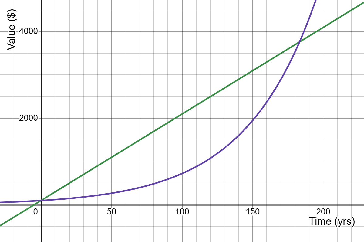
  2. Adjust the bounds on the x-axis and y-axis as needed to ensure that the resulting graph shows all features of the function(s) over a realistic time interval.
  3. If appropriate, add descriptive labels for the axes.
Note that step 2 can also be achieved with a touchscreen or mouse and keyboard. On a touchscreen, use the pinch and spread gestures with your fingers touching the axes. Alternatively, hold down the shift key on the keyboard while clicking and dragging the mouse on the axes.

Example D.1.10. Graphing with Desmos.

The functions \(P_1(t)=100+20t\) and \(P_2(t)=100(1.02)^{t}\) model the value \(P\) in dollars of two different investments after \(t\) years. Please do not be confused by the use of subscripts 1 and 2 on the function names; their purpose is simply to distinguish between the two functions.
Create a single graph showing \(P_1\) and \(P_2\text{.}\) There are two intersection points: be sure that both are visible in the graph.
Solution.
Step 1: Enter the functions. In the Desmos graphing calculator, we enter one equation into the expression line. Hitting enter or clicking in the space directly below the expression line brings up another line where we enter the other equation as seen below.
Screenshot from Desmos. Both equations are entered, but the graph shows only a portion of one line.
Step 2: Adjust the bounds on the axes. We click on the wrench icon to access the Graph Settings menu in Desmos. Then, through experimentation, we adjust the intervals for the x- and y-axes until the graph shows both functions and both of the points where they intersect. (This can also be done using pinch and spread gestures on a touchscreen or holding down the Shift key while clicking and dragging on an axis.)
Step 3: Add labels. In the Graph Settings menu, we type labels in the boxes provided. The x-axis label is "Time (yrs)" and the y-axis label is "Value ($)".
To use the graph in a document or submit in an assignment, we click on the export icon that looks like a box with a curved arrow pointing out of it. The "Export Image" option allows the graph to be downloaded as a picture file. The resulting graph is shown below.
Horizontal axis shows values between 0 and 200 and is labeled Time (yrs). Vertical axis shows values between 0 and 4000 and is labeled Value ($). There is a increasing linear function and an increasing exponential function. They intersect at (0,100) and near (180, 3800).
In the resulting graph, the straight-line is the graph of \(P_1(t)=100+20t\) and the curve is the graph of \(P_2(t)=100(1.02)^{t}\text{.}\)

Note D.1.11.

In mathematics, we use the term graph very broadly to refer to to indicate both the entire image and the individual curves inside of the graph. In the previous example, the resulting graph contains the graphs of \(P_1(t)=100+20t\) and \(P_2(t)=100(1.02)^{t}\text{.}\)